
Preventing errors is better than helping users recover from them. That’s an important principle in UX. When users must recover from an error (whether a mistake or a slip), they must interrupt their task to devote precious cognitive (and working memory) resources to fixing the problem, even if it’s only for a few seconds. Regardless of how easy it is to access your Undo function (and we hope you do have one!), it’s better to not have to use it at all.
Just the other day, as I was typing something in a browser, I got the following spellcheck option:
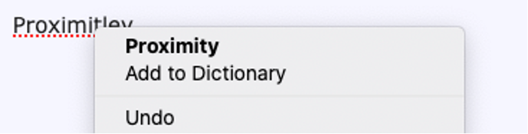
Do you notice the potential danger in this otherwise helpful little context menu (and can you guess which option I accidentally clicked due to inaccurate mousing)? Right next to the option to use one of the suggested spellings, there is Add to Dictionary. Literally, next to the option to fix a mistake is the option to make sure that I will forever make that same mistake! To add insult to injury, these options are very close to each other, so one could easily accidentally click Add to dictionary while trying to select the suggested correction.
Designers often overlook the fact that the user may not be paying full attention to their design. Users often slip into automaticity, especially when they’re doing repetitive work. In the spellcheck example, it’s very possible that the user has repeatedly selected the second option from a contextual menu (for example, Copy) and is now on autopilot, falling prey to the habit created by the previous actions.
This type of situation is not unique to contextual menus. In fact, placing destructive and benign actions in close proximity is one of the top 10 application design mistakes that we’ve seen year after year. It occurs all the time — in tables, dropdown menus, confirmation dialogs, error messages, and wizards.
So, what can be done to avoid these kinds of mistakes? Let’s take a quick detour back to the beginnings of UX for some alternative design options.
Shape Coding and Communicating to the Distracted
One of the starting points of the modern UX discipline was the application of psychology to industrial design in the 1940s. During World War II, Alphonse Chapanis (among others) worked to understand why pilot errors caused a large number of B-17 bomber crashes during landings. He noticed that the lever that pilots used to lower the landing gear and the one that lowered the wing flaps were identical and differentiated only by placement. This similarity caused pilots to mix the two up, especially in high-stress moments such as landing a plane. Chapanis helped redesign the controls on the B-17 bomber to avoid pilot error by changing the shape of one of the two levers, so pilots could quickly tell which lever they had in hand.
Shape-coding controls so that they felt different and didn’t require vigilance was a major innovation that led to other, similar design considerations, such as adding tactile textures to controls, changing how users physically actuate the control (e.g., pushing vs. pulling vs. rotating), and yes, using proximity (or lack thereof) to differentiate what each control does. The main idea is that we can signify not only how to interact with the control, but also suggest what effect the control will have in a way that doesn’t require the user to consciously attend to it — a physical lever that has some resistance, compared to one that’s easy to pull, for example, communicates that the hard-to-push lever is perhaps more consequential, even to a person who isn’t paying full attention.
Part of why this is so effective is explained by human cognition. Behavioral economist Daniel Kahneman outlines two modes of human thought in his modern classic Thinking, Fast and Slow: System 1, which is fast, instinctive, and somewhat automatic, and System 2, which is laborious, considerate, and slow. When users perform repetitive activities, they often do not engage their System 2 (slow, logical) thinking — they rely on the somewhat unconscious System 1, and, to communicate with them in those moments, we have to use design attributes that System 1 thinking responds to — for example, preattentive traits, which are visual attributes that our brain responds to before we’re paying full, conscious attention.
Differentiate Controls with Redundant Visual Signals
There is usually some logic behind the decision to place benign and destructive options next to each other — for example, the controls are conceptually related. But two options that are related (like Save and Delete) could have very different effects.
Therefore, designers must strive to differentiate between such options as much as possible. The label is one way to individualize them, but it’s not enough. And, of course, when we design digital products like websites and applications, we cannot use tactile properties. But we can rely on visual treatment and on positioning.
Grammarly, for example, uses the same position of spell correction and Add to dictionary options as Firefox does, but critically, uses several other cues such as color, icons, relative size of text, and alignment to prevent user slips.
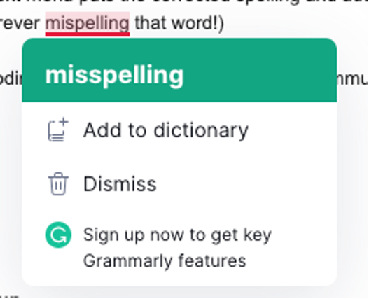
Another option is to separate the consequential option (e.g., Delete, Discard Changes, Mute, Make Default) from the others by placing it farther away from them. It’s okay to leverage Fitts’ Law and make it a little harder to select the consequential option, especially if it’s going to be destructive. The few additional milliseconds that it might take a user to move their mouse or finger to the other option is nothing compared to the frustration and time it would take to undo a major error. In the above example, we could move the Dismiss action up since it’s an in-between outcome with less serious consequences (accept the current spelling in this instance, but don’t add it to the dictionary so that it’s considered correct in future documents).

Summary
Avoid placing highly consequential actions (that will require a lot of user work to fix if accidentally triggered) directly next to options that are benign. Add additional space and redundant visual signals to indicate which options are different than other, conceptually related commands.
References
Matthias Deller, Achim Ebert, Michael Bender, Stefan Agne, and Henning Barthel. 2007. Preattentive visualization of information relevance. In Proceedings of the international workshop on human-centered multimedia (HCM '07), 2007, Augsberg. DOI: http://dx.doi.org/10.1145/1290128.1290137
D. Kahneman, 2015. Thinking, fast and slow. New York: Farrar, Straus and Giroux.
C. Kuang, R. Fabricant, 2019. User Friendly: How the Hidden Rules of Design Are Changing the Way We Live, Work, and Play. MCD


