Redesigning Babylon’s appointment booking system — A UX case study
In 2019 to 2020, GP at hand, an NHS service powered by Babylon’s technology, started to diversify its offering by making Nurses, Physiotherapists, Travel Health Specialists, and other clinician types available for our members to book appointments with.
My job was to redesign the appointment flow to recommend the right clinician to the patients’ needs in a suitable time frame.

My role
I led the design of the experience from June 2019 across iOS, Android, and Web platforms.
I worked alongside a Researcher, Content Designer, 2 Product Managers, a Delivery manager, a Tech Lead, and a team of 8 engineers.
I worked on this from inception to launch in April 2020 and will also take on any future iterations.
PROBLEM SPACE
Improvements for scaling
In just 2 and a half years, GP at Hand has taken on tens of thousands of patients across UK cities, delivering thousands of appointments each week. The app, designed in 2015, now needed to scale alongside the growth of the company and it was time to design with margin in mind.
The aim
The goal of the project was to expand the clinician types that we offered to alleviate pressure from our GPs, whilst improving the experience for members and enabling the future, global success of the company. All quite ambitious however, this would put us in an advantageous position both in value proposition and in managing costs.
High-level goals:
- Provide better, more appropriate care for our members.
- Allocate appointments to the clinicians with the most appropriate skills
- Create strong foundations to enable the growth of the business.
DISCOVERY
Starting with the basics
As this was a completely new concept we started internally to gather insights on concerns and desired outcomes for both business, members & other user types.
We held 15 workshops with key representatives from a range of product areas and departments globally over the course of a week including Member Support, Clinicians, Marketing, and more. In doing so, we increased awareness and understanding of a business problem that impacts Babylon as a whole.
These cross-functional sessions also gave us visibility of what is and isn’t in scope, helping us to focus on a suitable and viable solution.

Reframing the problem
We had a couple of main hypotheses:
- Members book with GPs because they don’t know which clinicians GP at hand* has to offer and how those clinicians could help.
- Members book with GPs because that is what they know and trust.
The app offers very little guidance and education around the different clinician types on offer and because there is conflicting information about how and when to use them, members were assuming GPs were the most suitable clinician.
…How might we educate our users so they know which clinician is best suited for their needs.
Ideation
For the ideation stage, the main stakeholders were included and tactically they were given a focus that was opposite to their views. There were boundaries that we put in place to eliminate but also help focus the ideas.

Off of the back of the ideation session, we had a high-level flow suggestion that all of our stakeholders were aligned on as well as a mixture of quick wins and a longer-term view.
We saw lots of opportunities with this flow including:
- Aligning with different parts of the app
- Showing our clinicians as specialist
- Creating a personalised experience
- Integrating with AI

Testing our assumptions

We tested and iterated on a prototype with GP at hand members and also the general public digging into:
- The new proposed flow and the ease of booking
- The concept of different clinicians for different needs
- The reactions to the language used
During this testing phase, we changed from a low fidelity Figma prototype to a fully interactive web-app to allow users to explore expectations from their own experiences.
Through intensive testing, we found out that:
The end-to-end flow works well
Positive reactions to selecting appointment category upfront, then describing symptoms. Single-focused questions helped lower cognitive load. The latter was great to get feedback on as we had stakeholders worried about the flow feeling longer as it was now over multiple screens.
“Feels quicker or the same. I don’t know why it would be the same maybe because it was more concise…”
Symptom searcher was misunderstood or missed completely
Some participants misunderstood the purpose of the search bar, with a variety of expectations, including seeing it as somewhere to ‘speak into’, a place for self-help and confusing it for the chatbot entry dialogue box on the home screen. (We have dropped this feature for now.)
“I look at it more as needing self help but not needing to speak to an actual doctor”
The ability to see more clinician types is seen as a differentiator
Within the NHS people are used to seeing other medical professionals upon referral. The ability to book appointments with different clinicians than just GPs was seen positively.
“I think it’s more useful to have different practitioners available. Not something you get at your usual GP…”
“I like that I have the choice because it gives me power in my care”
GPs being seen as a familiar/safe option for unknown health needs however recommendations are welcome even if they would have not previously been considered based on previous experiences and pressures on GPs.
“I’d prefer to see a dr if it’s something that I think it’s severe, if not as severe I’d be okay seeing a nurse.”
“If you don’t know [which clinician to go for] you would default to a GP as they can do everything…”
These findings helped us strip back our MVP and the iterations to get there.
Validating success
Validating the solution from a data point of view was the next goal. Based on a normal GP practice we knew that on average half of the appointments could be done by non-GPs but, internally, there was no easy way of knowing the demand for different clinician types.
How we did this
We had a clinical code that the clinician entered at the end of an appointment and the class that they belonged to. This is a code reference to indicate the reason for the appointment.
Eg:
Code [tonsilitus] class [ENT]
Code [headache] class [Neurology]
Using a year’s worth of data we analysed the classes to firstly understand which clinician could do what and also to identify the prevalence of the classes — this was to inform which categories to show on the initial page of the prototype.
The outcome of the analysis

KEY FINDINGS
48% of appointments still needed to default to a GP
16.5% of that could break down across the other groups
35% of appointments could be done by a ‘Prescribing non-GP’
Generally, GPs are more expensive than the other clinician types this data was great to see. This was also the first time that the clinical team had oversight of the demand for the different appointments so this was crucial for informing the hiring to enable the success of this project.
LAUNCH
Build fast and iterate
Now we had the numbers and a solid prototype it was time to break it into achievable chunks so we could start seeing impact sooner.
The steps we took:
1. Added more guided information about our different clinicians.
2. Broke-down the flow into a series of steps.
3. Added in the categories that called out which clinician type was recommended.
4. Iterated on the recommended state to make it more focused.
THE IMPACT
Improved quality of care
Since launch, our members have said that the flow has improved their experience. Feedback has been that it seems more specific, smarter, and personalised.
“It takes about a second longer because you have to choose a category but you get more specialised help.”
“It feels more personalised. It takes away some of the thinking you have to do about what your problem is.”

Increased awareness of non-GPs
We started to create awareness of the different clinicians we had to offer. We outlined the speciality of each clinician which encouraged patients to book with more appropriate care providers tailored to their specific needs.
“This was useful as I wouldn’t have thought to book directly with an ANP rather than a GP for the issue I had.”
“It’s very useful as I was having to go to a GP for a repeat prescription previously which I felt to be unnecessary.”
“I think this is a great system, can go straight to the right person without bothering the GP first”

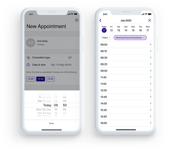
Increased visibility of availability
We introduced a new way to view times to help with viewing both short-term (same day) and mid-term (1–2 weeks) availability and slots. It also aligned the experiences with booking a digital and face-to-face appointments.
“I like it as I can see more available slots and choose according to my schedule more easily”
Enhanced data collection
With this change, we could now accurately track the demand for different appointment types. This increased level of insight and allowed us to plan our clinician’s rotas and forecast more effectively.
Measuring success
Here are some other numbers showing the usage of the different clinician types and as of May 2020, we were 7% ahead of our H1 target.

Key learnings
Taking stakeholder on a journey
In many projects I’ve been involved in, stakeholders have just been there for replaying information. With this project, they were involved in the inception discussions, ideation sessions, and user testing so they understood and supported the decisions we made.
Stakeholder working group
For this project, we had a biweekly working group with our stakeholders to align on business and product decisions as a group. This meant that we were all on the same page in terms of what we were delivering, how, and when.
Create realistic iterations
The project was split into achievable chunks so we were constantly delivering small, margin moving improvements over a few months. This meant that we could see our successes sooner as well as have data to understand how each iteration was moving the needle.
Use data to validate & drive future decisions
Linking to what I just mentioned, we had dashboards set up so we could understand, quantitatively, our user’s behaviour, how the new flow was performing, and how successful our solution was. We used the data to understand when we needed to schedule more clinicians, which categories were underperforming, and also which areas needed further analysis.
What’s next?
Our next focus will be scaling this out to other regions through both technical and user-focused enhancements. We will also be doing some deep dives into the different categories as well as running a few A/B tests to understand if we can further improve the uptake of Non-GP clinicians.
This was a huge project and very collaborative so want to give a massive shout out to the fantastic team:
Yani Petrova, Nkira Anyika, Will Holford & Jordan Elboim for some insane stakeholder management. Lucia Turco and Joe Frazer for always bringing it back to our users. Ryan Howitt for helping us measure our success and identify areas for improvement with amazing dashboards. Nick Cowan for the slickest content. Topaji Nagloori for your relentless and thorough QA support. Kamal Wood, Antonis Tsiapaliokas, Adrian Sliwa, Daniel Sobczak, Chitra Kotwani, Nico Robin, Rob Brentnall & Onome Sotu for smashing the engineering deadlines. Thank you also to our clinical and business stakeholders for supporting us on this exciting journey 🙌 🙌

