


Working on your brand is an investment that many see as frivolous when you’re an early-stage startup. At Maze, we made the conscious decision to invest in our brand early for two main reasons:
- The majority of our first users were designers, so they were sensitive to the effort and craft we put into our brand work
- A strong brand is a business investment: partnerships, hiring, enterprise sales—all of these become easier when you invest in your brand.
In this article, we go behind the scenes and share the process we went through to create the Maze brand over the past three years. From the initial identity we built when we were just getting started to the thinking behind our latest rebrand, we’ll describe the decisions we took to create the Maze brand.
For all our branding work, we worked with Romain Briaux, designer and co-founder of Herve Studio, who’ll share his experience and advice on branding later in this article. Let’s get started.
Naming the company: Every interface is a maze
When we founded Maze three years ago, my co-founder Thomas and I spent a lot of time discussing the name of our company. We wanted something simple and abstract that would remain relevant as we grew. And then it hit us: Maze.
People interact with products with a goal, and what separates them from that goal is the UI and UX choices you make as the product creator.
If you think about it, every interface that’s presented to a user for the first time is a maze. People interact with products with a goal, and what separates them from that goal is the UI and UX choices you make as the product creator. And so, the product designers’ role is to make this maze of choices as seamless as possible for users.
The name fit our goal perfectly: we wanted to help designers to create better UX by enabling them to test easily. It was also easy to remember and pronounce and abstract enough that it would allow us to grow the brand in the future in any direction we wanted.
Building the foundations
Now that we had a name, the goal was to translate it into a full system with assets: logo, colors, tone of voice. That’s when our collaboration with the incredible Romain Briaux started. On top of being a great friend, Romain and I worked on my previous startup’s brand, so when I pinged him about the opportunity to develop Maze’s identity, we were thrilled to work together again.

Maze's first brand identity
Our first brand system included:
- A glyph for our logo: an actual maze looked from above representing the letter M
- Tone of voice guidelines: our mission was to empower designers to test, so we wanted the tone to be playful and approachable
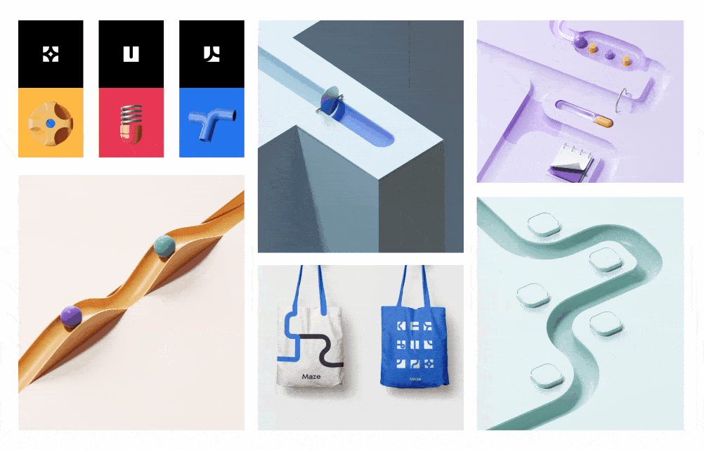
- Illustrations: the visual representation of our brand. The illustrations represented actual mazes in a toy-like format, in which the balls were the testers that interacted with interfaces.
For more than two years, we had used this system and continued adding to it. Overall, the brand resonated with our community and we saw our homepage shared online a lot.

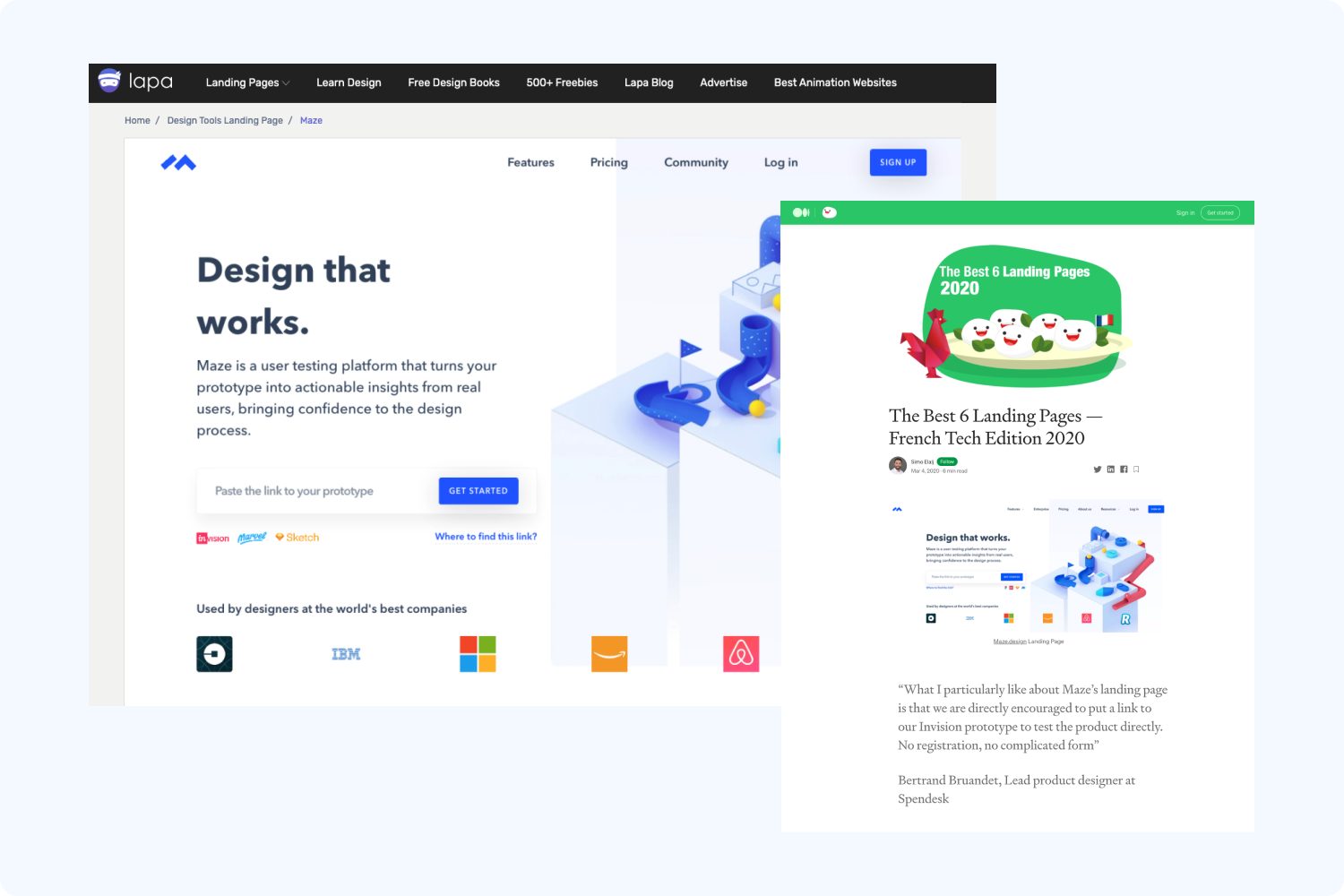
Websites featuring Maze's previous homepage
A refreshed identity for a new journey
During the past three years, our vision and product evolved several times. Most recently, over the summer of 2020 with the help of Hema Padhu, we reworked our product positioning. Maze went from a usability and research platform to a rapid testing platform that aims to empower anyone to test and learn quickly.
A new vision, supported by a new product for an expanded user base, meant that our previous brand wasn’t working anymore. Even our domain maze.design became obsolete. While design will always remain at the core of Maze’s DNA, we slowly started to expand our vision beyond design testing.
We needed a new brand to reflect our vision for the future.
We needed a new brand to reflect our vision for the future. Getting started was challenging for a couple of reasons. First, our current brand was highly praised and loved—changing it meant the possibility of getting it wrong. And second, the company was being recognized more and more every day, so making a change could impact that.
Yet we decided to take the leap. In September 2020, we contacted Romain again and went back to the drawing board.
First steps: Defining key brand pillars
Our rebranding work started way before we created any designs. Part of our repositioning involved developing the key pillars of our brand: the vision and mission, brand promise, and values. These elements helped us define what we stand for as an organization and what we aim to deliver to our customers.
Empower anyone to test and learn rapidly.
Maze’s mission statement
Next, we used those brand elements to fuel the work on our tone of voice (TOV) and establish key principles that reflected our brand. We ended up with these three TOV principles:
- We’re connectors. We connect the dots for our users. We communicate complex ideas in a clear, easy-to-understand, actionable, and sometimes, fun way. Only experts can make what's difficult look easy, and that's our job.
- We’re empathetic. We put ourselves in our users' shoes and give a helping hand when needed. We're passionate about the problems Maze solves for our users and want to inspire and empower them to achieve their goals—but we're never pushy. Everything we create is with intention.
- We’re human. We want our users to have a delightful experience when engaging with us and we believe a big part of that is speaking like a human. We're informal, transparent, and don't mind sharing our playful side from time to time.
From here, we started working on our visual identity. We focused on translating our values into design concepts that represented Maze and the rapid testing category. Along the way, we referred back to the brand values to make sure our visual identity aligned with them.
A long iterative process
Defining our brand identity took several tries; we went through multiple iterations of the brand over a period of one and a half months. We explored three brand concepts before we arrived at the final version.
Concept 1: The Playground

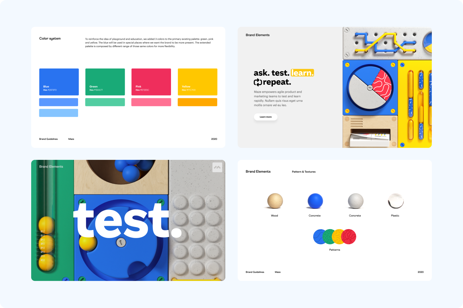
Concept 1: The Playground
The first concept we explored approached user testing in a playful way. The color palette was bright and introduced new colors to our design system. The key idea of this concept was to make user testing not boring anymore. Instead, the process was transformed into a game: build your maze, test, learn, repeat.
Concept description: “Maze empowers people to test by making user research accessible and enjoyable to anyone. Maze educates people about research and gives them easy and efficient tools. Maze allows your project to be led by actionable and understandable data.”
Concept 2: The Lab

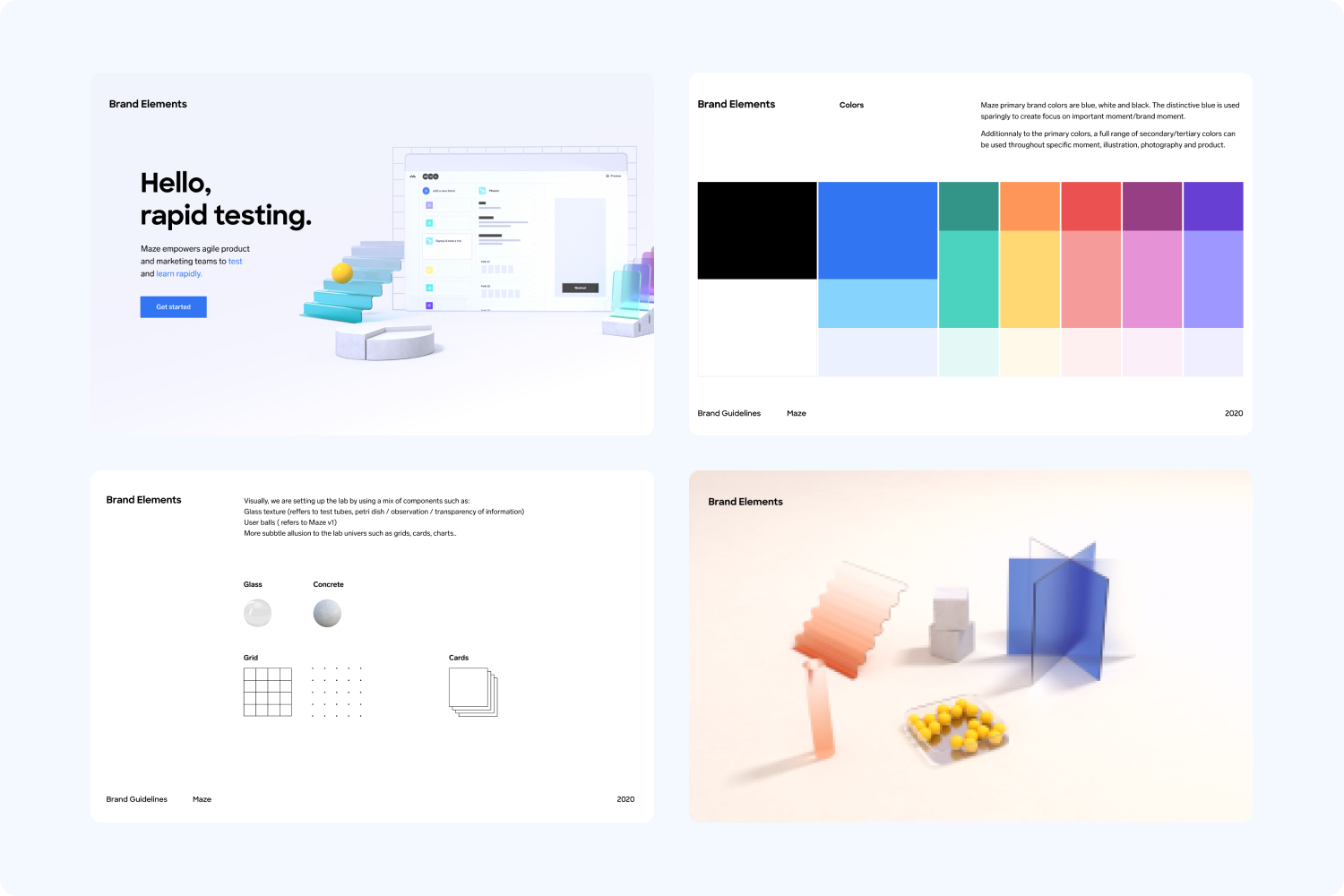
Concept 2: The Lab
The second concept we explored was that of a laboratory. With this direction, the lab and science aspect referred to:
- the transparency of the information
- the direct way to communicate and display things
- the iteration aspect of re-testing, ie., the search for the “truth”
Concept description: “Maze is the place where product and marketing teams come to test, observe, analyze and act on results. Maze guides those teams in the process and empowers them by giving them the tools, knowledge, and confidence needed.”
We thought that the Lab concept was a great representation of the testing category, while the playfulness of the Playground color palette was closer to our tone of voice. We liked aspects of both concepts, so with this feedback, Romain and his team merged the two ideas together.
Concept 3: The Fun Lab

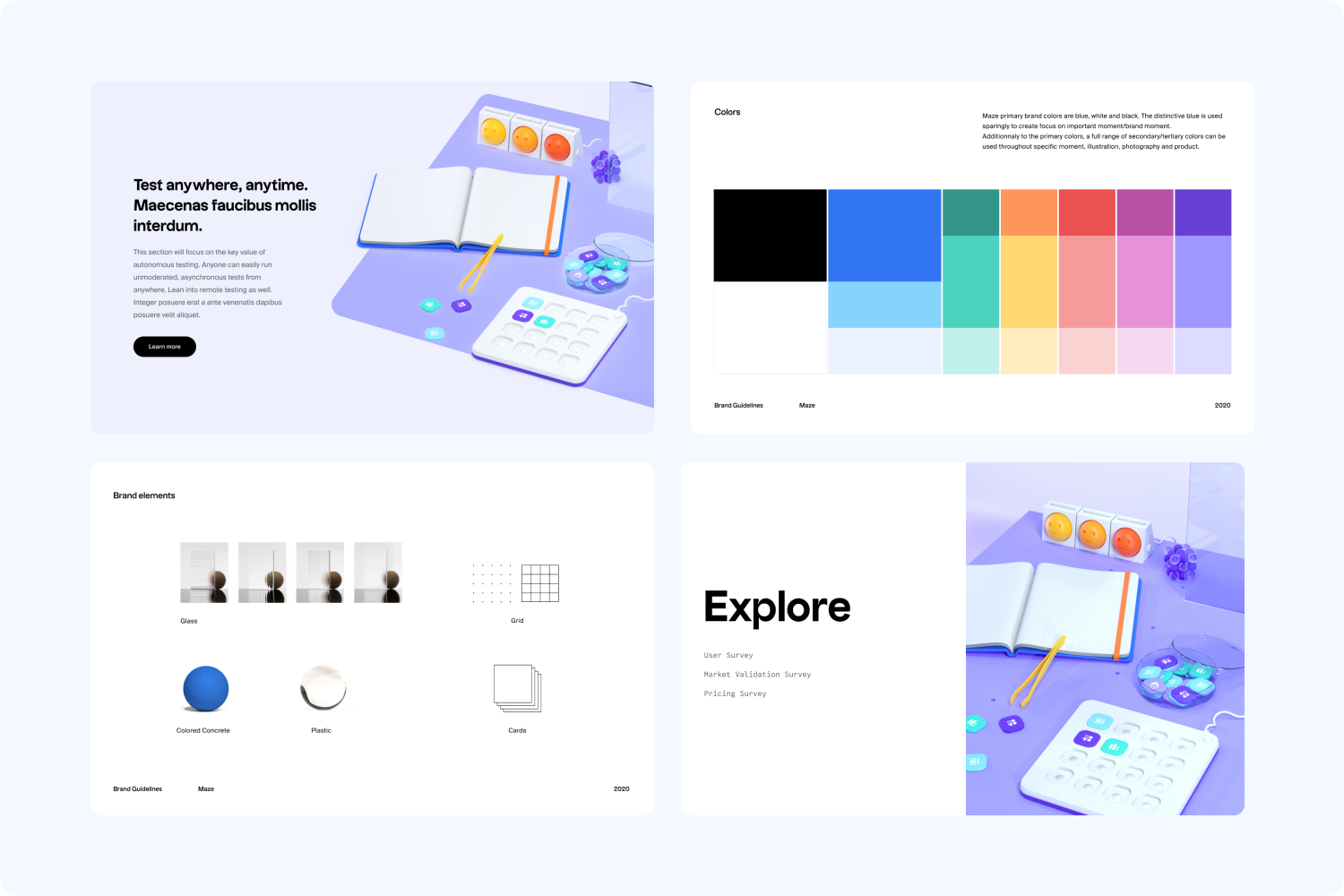
Concept 3: The Fun Lab
The Fun Lab was a combination of the two first concepts.
Concept description: “Remember the science museum when you were a kid? Touching the plasma globe and your hair went up? This is what Maze is. Making testing fun and accessible to anyone. It's not a toy, but it's also not a beaker either.”
We loved it so much. But as a company that values feedback, our instinct was to get this in front of multiple stakeholders’ eyes to understand how people felt about it.
Moment of truth: Testing first impressions
While branding is not a democracy, not exposing your design for feedback can have dramatic consequences. We decided to collect first impressions from key stakeholders.
Digging into the feedback, we identified two things happening:
- The brand wasn’t elevated enough. It's one thing to be playful, it's another to look childish. We needed to make the elements look sharper and more professional.
- The concept wasn't working. We started analyzing the feedback and thinking back to all the decisions that led to this identity. That's when we realized we were placing the focus on the wrong thing.
Going back to the drawing board
The magic of Maze isn’t in how fast you test—it's in how fast you can make decisions. Our first incline was to represent Maze, the product in our branding. Instead, the output—the decision-making—was more important to our users.
The magic of Maze isn’t in how fast you test—it's in how fast you can make decisions.
Realizing this made us rethink our approach and we got back to the drawing board energized, thinking, “How do we represent rapid decisions in our branding?”
To answer this question, we had to first represent a decision. We went through multiple concepts again, illustrating a decision as a truth revealing glass, and as a highlighter, but ultimately those ideas weren't scalable as a brand concept. We had to dig deeper.
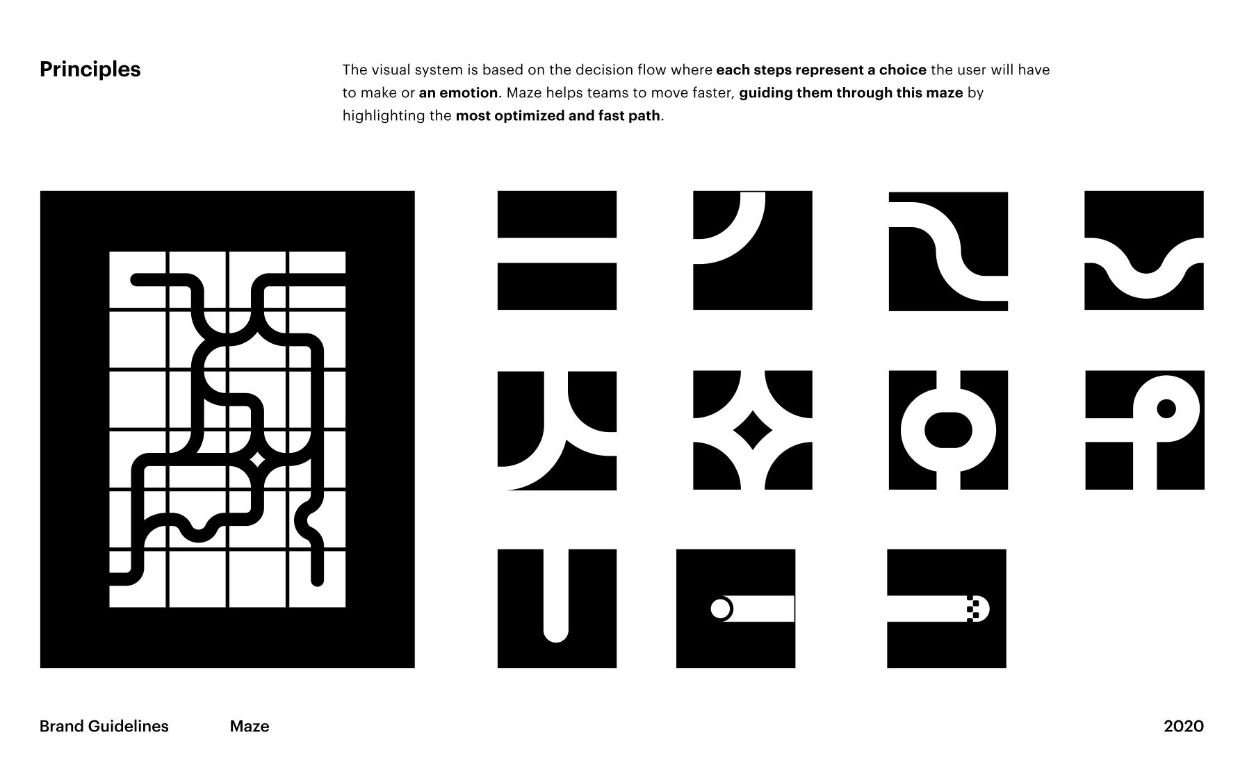
Evolving the brand: Every decision is a maze
Our original brand was based on a very simple concept: every interface is a maze users go through. So the branding represented a playful maze, where each path illustrated interface elements and the balls were testers navigating the interface.
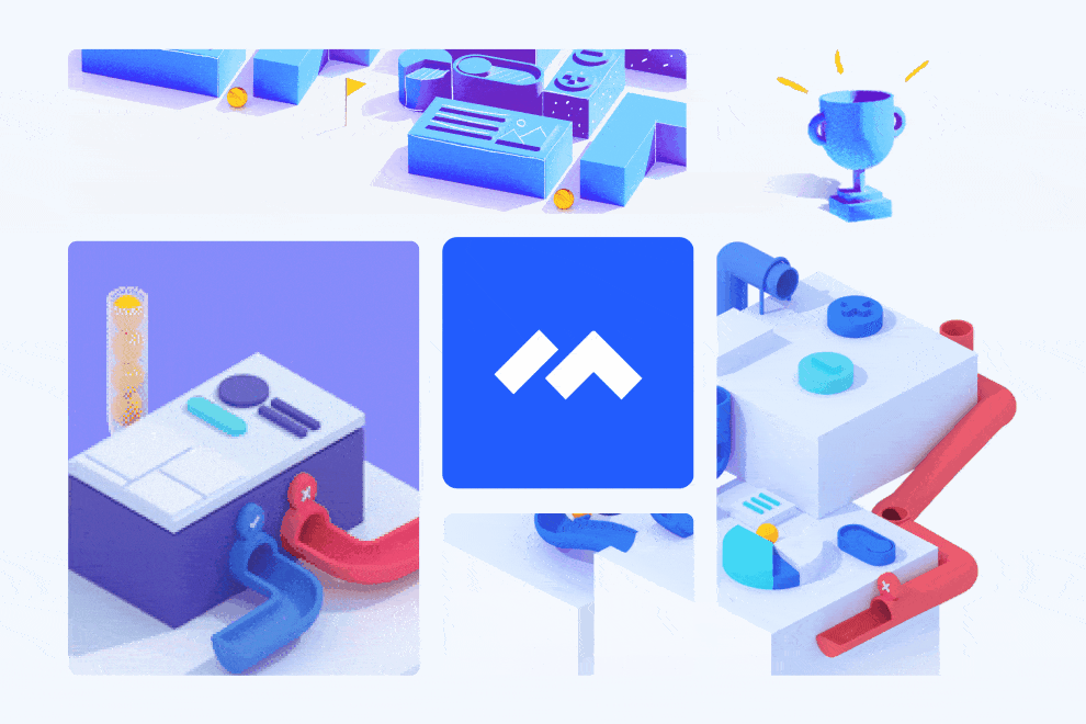
Similarly, every decision a team has to make to build a product is a maze—one that's very hard to navigate too. This concept was the natural evolution of our current brand and fit with our product vision of zooming out from the maze of navigating an interface as a user to the high-level, decision-making maze of building a product as a team. In this evolved concept, the balls represent product teams and the paths—all possible decisions teams face.

Maze's new visual identity concept
We finally felt like we arrived at something that represented our brand well. We translated this concept into a new visual identity and created a brand system around decision paths. We also reworked our glyph using a path system.

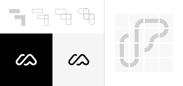
Reworking our glyph using the path system
Finally, Romain translated the visuals into 3D and 2D representations, where each decision can both be flat or 3D-illustrated.

Maze's new brand
Maze's identity evolved into a more mature brand. While the first identity was speaking more to design people and designer teams, now, the brand’s goal is to reach to product teams at a larger scale. We kept the same system as before but developed it to include new rules and expand the color palette.

Romain Briaux, Designer and co-founder at Herve Studio
Why investing in your brand is key
To sum up, we asked Romain to tell us a bit about why creating a distinct brand is important for today’s companies and what the key to a successful brand is. Here’s Romain on why branding is key:
“Investing in branding is something you can't really measure at first, but it’s an effective way to make your brand durable. As the saying goes,‘You only have one chance to make a good impression.’ Branding is all about that: it helps a lot with sharing your message. And if your product is visually appealing and the branding is aligned with your message, you will attract the right audience.
Today, we're overwhelmed with information everywhere around us, on all our screens. Having a distinct brand elevates your company and makes it easier to stand out from the crowd. A great brand reflects your personality and unique attributes.
As a human, you want to be unique because you are unique, so it’s the same for your brand. Creating a remarkable brand is the best way for people to remember you and easily get the message you want to communicate.
The key to building a great brand is consistency. Branding is all about the rules you create, like when or where to use a color and why, and what the color pairing should be. Whatever you're including in your identity has to make sense as part of a global system.”
Creating a remarkable brand is the best way for people to remember you and easily get the message you want to communicate.
Romain Briaux, Designer and co-founder at Herve Studio


