
Today we're gonna learn CSS Grid properties so that you can make your own responsive sites. I'll explain how each of Grid's properties work along with a CheatSheet that covers everything you can do with Grid. Let's Go 🎖️
Table of Contents :
- Grid Architecture
- Parent Properties
- Children Properties
- Short Hands
- Conclusion
You can watch this tutorial on YouTube as well if you like:
First, What is Grid?

Grid is a blueprint for making websites.
The Grid model allows us to layout the content of our website. Not only that, it helps us create the structures needed for creating responsive websites for multiple devices.
Here's a simple demo which I created using Grid as the main blueprint.
Desktop View

Mobile View

Grid Architecture
So how does Grid architecture work? The Grid items [Contents] are distributed along the main axis and cross axis. Using various Grid properties, we manipulate the items to create our website layouts.

By the way, we can join multiple rows and columns, just like Excel software, which gives us more flexibility and options than Flexbox.
Here's a CheatSheet I made for Flexbox
Grid Chart --

This chart contains every possible property you can use when using grid. Grid properties are divided into -
- Parent properties
- Children Properties
Note : The red colored text are the shorthand properties
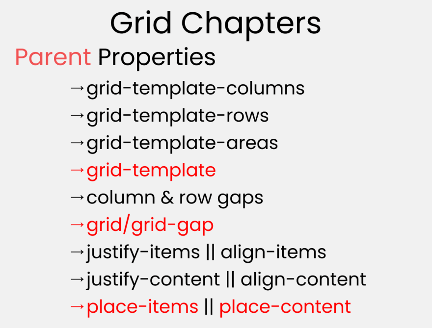

At the end of this tutorial, You'll have a clear understanding of how to use all of those properties
How to Set Up the Project

For this project, you need to know little bit of HTML, CSS, and how to work with VS code. Follow along with me as we complete the following tasks:
- Create a folder named "Project-1" & Open VS Code
- Create index.html and style.css files
- Install Live Server and run it.
Or, you can just open Codepen and start coding.
At the end of this tutorial, you will be able to make accurate and beautiful website layouts.
And...we're all set! Let's start coding. 😊

HTML
create 3 boxes inside our body tag. Like this 👇
<div class="container">
  <div class="box-1"> A </div>
  <div class="box-2"> B </div>
  <div class="box-3"> C </div>
</div>
CSS
Step-1
Let's clear our default browser styles. Follow me 👇
*{
  margin: 0px;
  padding: 0px;
  box-sizing: border-box;
}
Step-2
Inside the body selector, do these adjustments
body {
  font-family: sans-serif;
  font-size: 40px;
  width: 100%;
  min-height: 100vh;
}
Step-3
Now, Let's style our boxes by selecting all of them together ->
[class^="box-"] {
  background-color: skyblue;

/* To place the letter at the center */
  display: grid;
  place-items: center;
}
Note : Don't worry, we'll discuss about those grid properties in details.
Step-4
Now, place some gap between our boxes like this 👇
.container {
  display: grid;
  gap: 20px;
}
But Wait....

Before starting, you need to understand the relationship between parent & child classes.

For the Grid Parent property, we will write inside .container class. For the Grid Children Property, we will write on .box-* classes
Grid Parent Properties

First, Let's learn The grid Parent properties !
grid-template-columns
This is used to define the Number & Width of columns. You can either individually set the width of each column, or set an uniform width for all columns using "repeat()" function.
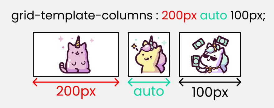

To recreate these results, Write on CSS These lines ->
.container {
  display: grid;
  gap: 20px;

/*  Change the values     👇 to experiment */
  grid-template-columns: 200px auto 100px;
}
Note :
- The pixel values will be an exact measurement. The "auto" keyword will cover available space.
- if you use fr (fraction unit) measurement, all the boxes will be equal in size
grid-template-rows
This is used to define the Number & Height of rows. You can either individually set the height of each row, or set an uniform height for all rows using "repeat()" function.

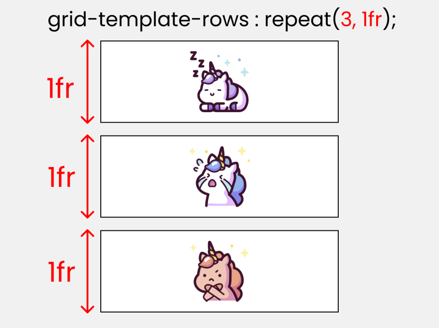
To test these results, Write on CSS These lines ->
.container {
  display: grid;
  gap: 20px;
  height: 100vh;

/* Change the values  👇 to experiment */
  grid-template-rows: 200px auto 100px;
}
grid-template-areas
This is used to specify the amount of space a grid cell should carry in terms of column & row across the parent container. Life's Quite Easier With this as it allows us to see visually what we're doing.

Call it, the blueprint(template) of our layout👇
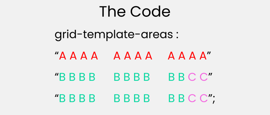
To experiment with this, you need to understand both the parent and children property -
- grid-template-areas : The parent property who will create the blueprint
- grid-area : the children property who will follow the blueprint.
First, create the blueprint
Like this 👇 inside the parent .container class
.container {
  display: grid;
  gap: 20px;
  height: 100vh;

  grid-template-areas:
    "A A A A   A A A A   A A A A"
    "B B B B   B B B B   B B C C"
    "B B B B   B B B B   B B C C";
}
Implement the blueprint
Target all our children .box-* classes and set the values like this ->
.box-1{
  grid-area: A;
}
.box-2{
  grid-area: B;
}
.box-3{
  grid-area: C;
}
Note : The grid-area property will be discussed again on the grid children property section
column-gap :
This property is used to place gap between Columns inside the grid 👇

To test This, write 👇
.container {
  display: grid;
  height: 100vh;

  grid-template-columns: 100px 100px 100px;
//Change values👇 to experiment
  column-gap:  50px;
}
Note : column-gap works with grid-template-columns
row-gap :
This property is used to place gap between Rows inside the grid 👇

let's test This 👇
.container {
  display: grid;
  height: 100vh;

  grid-template-rows: 100px 100px 100px;
// Change   👇  values to experiment
  row-gap:  50px;
}
Note : row-gap works with grid-template-rows
justify-items :
This is used to position grid-items (children) inside grid container along the X-Axis[Main Axis]. The 4 values are 👇

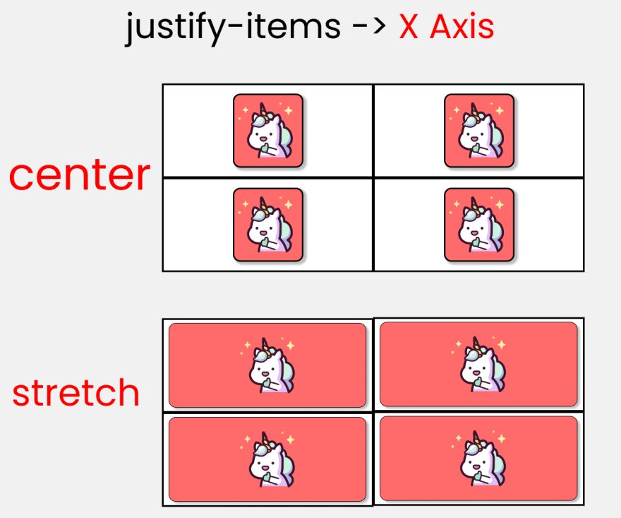
If you want to test this, then add 1 more box inside HTML ->
<div class="container">

  <!--Other boxes - A, B, C are here-->

  <div class="box-4"> D </div>
</div>
and in css ->
.container {
  display: grid;
  gap: 50px;
  height: 100vh;

// each box is 200px by 200px
  grid-template-rows: 200px 200px;
  grid-template-columns: 200px 200px;

//  Change values 👇  to experiment
  justify-items : end;
}
align-items :
This is used to position grid-items (children) inside grid container along the Y-Axis[Cross Axis]. The 4 values are 👇

Don't change anything on HTML, write in css ->
.container {
  display: grid;
  gap: 50px;
  height: 100vh;

// each box is 200px by 200px
  grid-template-rows: 200px 200px;
  grid-template-columns: 200px 200px;

//  Change values 👇  to experiment
  align-items: center;
}
justify-content :
This is used to position our grid [Basically everything] inside grid container along the X-Axis[Main Axis]. The 7 values are 👇


Don't change anything on HTML, write in css ->
.container {
  display: grid;
  gap: 50px;
  height: 100vh;

// each box is 200px by 200px
  grid-template-rows: 200px 200px;
  grid-template-columns: 200px 200px;

//  Change  values  👇  to experiment
  justify-content: center;
}
align-content :
This is used to position our grid [Basically everything] inside grid container along the Y-Axis[Cross Axis]. The 7 values are 👇

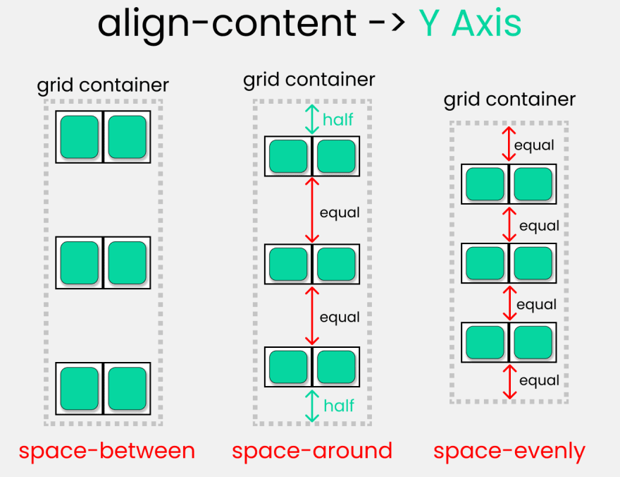
Don't change anything on HTML, write in css ->
.container {
  display: grid;
  gap: 50px;
  height: 100vh;

// each box is 200px by 200px
  grid-template-rows: 200px 200px;
  grid-template-columns: 200px 200px;

//  Change  values 👇  to experiment
  align-content : center;
}
Take a Break
So far so good! Take a break, You deserve it !

Grid Children Properties

Now, Let's look at grid children properties
The Grid Scale
I made this grid scale to demonstrate the calculations of how rows and columns are joined together. We can use any 1 of the 2 types of measurement -
- The digit [1,2,3,4, etc...]
- the span keyword

You'll get a clear picture of this guide ☝️ when we write code in just a short moment
The illustration below 👇 shows the start & end points of row and column of a single cell.

HTML
To experiment with the grid scale and understand the following properties, make 4 boxes inside body tag -
<div class="container">
  <div class="box-1"> A </div>
  <div class="box-2"> B </div>
  <div class="box-3"> C </div>
  <div class="box-4"> D </div>
</div>
We're gonna utilize the repeat() function. What it does is, it repeats our code to a certain time. Here's an example 👇
grid-template-columns : repeat(5,1fr);
This is ☝️ equivalent to writing this 👇
grid-template-columns : 1fr 1fr 1fr 1fr 1fr ;
A Quick Note :

When we use the fr [ Fraction ] unit, we are dividing the screen area into equal proportions.
grid-template-columns: repeat(5, 1fr);
this ☝️ code is dividing our screen width into 5 equal parts.
We're set, let's start !
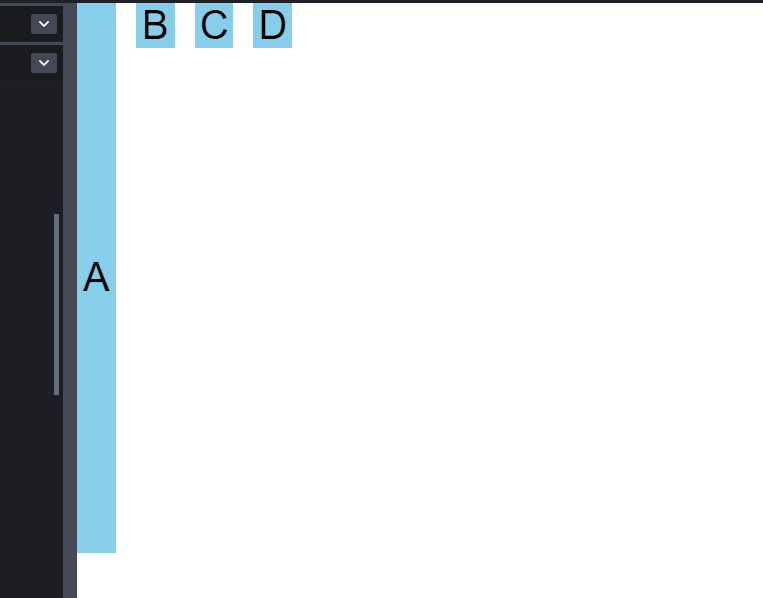
grid-column : start/end
THESE 2 properties are used to join multiple COLUMNS together. It is a shorthand of 2 properties -
- grid-column-start
- grid-column-end
Write these on CSS
.container {
  display: grid;
  gap: 20px;
  height: 100vh;

  grid-template-columns: repeat(12, 1fr);
  grid-template-rows: repeat(12, 1fr);
}
The result -

Here, we are dividing our screen [ both width & height ] into 12 equal parts. 1 box is occupying 1 part or you can call it 1fr [ 1 fraction ]. the remaining 8 fractions along the width are empty.
As we are dealing with children properties, we need to target our .box-* classes like this -
.box-1{}
.box-2{}
.box-3{}
.box-4{}
You can experiment with any 1 or all of these boxes, I'll stick with .box-1
Let's bring our grid scale. we are dealing with columns, just focus on the columns, not rows.
The default scale of every .box-* classes are
grid-column-start : 1;
grid-column-end : 2;

/* The shorthand -> */
 grid-column : 1 / 2
We can write this ☝️ in the span unit as well, like this 👇
grid-column : span 1;
Let's assign the empty 8 fractions to .box-1 like this 👇
.box-1{
grid-column : 1/10
}
The result 👇

A Quick note :

How did i do the calculation? The box-1 occupies 1 box itself. And over that, we are adding more 8 boxes. At the last, must add 1 to indicate the end so, 8+1+1 = 10
Using the Span keyword
If You're confused by the 1st one, you can use this as it is easy to understand.
We need to add 8 boxes to .box-1 which is already occupying 1 box. So, we have to do 8+1 = 9
.box-1{
  grid-column : span 9;
}
This is gonna output the same result
grid-row : start/end
THESE 2 properties are used to join multiple ROWS together. It is a shorthand of 2 properties -
- grid-row-start
- grid-row-end
Let's experiment with it ! Here, I'll stick with .box-1
here's our grid guide. Now, only focus on the row scale, not column.
let's join 9 boxes to .box-1 along the row
Write these 👇
.box-1{
  grid-row : 1/11;
}
The calculation -> .box-1 holds 1 box, and add 9 more boxes, add mandatory 1 at last to indicate the end 9+1+1=11
The alternative 👇 using the span keyword
.box-1{
  grid-row : span 10;
}
The calculation -> .box-1 holds 1 box, and add 9 more boxes
9+1=10
The result so far 👇
grid-area :
At first, we need to setup grid-template-areas ☝️ Once done, we have to specify the names used in parent class inside the children classes, like this👇

Specifying grid-template-areas inside parent container 👇

Like this 👇 inside parent class
.container {
  display: grid;
  gap: 20px;
  height: 100vh;

  grid-template-areas:
    "A A A A   A A A A   A A A A"
    "B B B B   B B B B   B B C C"
    "B B B B   B B B B   B B C C";
}
specifying the names used in parent container inside children classes with grid-areas👇

Like this 👇 inside children classes
.box-1{
  grid-area: A;
}
.box-2{
  grid-area: B;
}
.box-3{
  grid-area: C;
}
Justify-self :
This is used to position 1 individual grid-item (children) inside grid container along the X-Axis[Main Axis]. The 4 values are 👇

Write these to experiment with the values 👇
.container {
  display: grid;
  gap :25px;
  height: 100vh;

/* // each box has equal size */
  grid-template-rows: 1fr 1fr;
  grid-template-columns: 1fr 1fr;
}
Remember ! This only works on the children classes. So, target any .box-* class. I'll target the 1st box
.box-1 {
/*  Change values 👇  to experiment */
  justify-self : start;
}
align-self :
This is used to position 1 individual grid-item (children) inside grid container along the Y-Axis[Cross Axis]. The 4 values are 👇

Let's Experiment with the values 👇
.container {
  display: grid;
  gap :25px;
  height: 100vh;

/* // each box has equal size */
  grid-template-rows: 1fr 1fr;
  grid-template-columns: 1fr 1fr;
}
Remember ! This only works on the children classes. So, target any .box-* class. I'll target the 1st box
.box-1 {
/*  Change values 👇  to experiment */
  align-self : start;
}
Short Hands

Let's look at these Grid Short-Hand Properties -
- place-content
- place-items
- place-self
- grid-template
- gap / grid-gap
place-content :

this is the shorthand of 2 properties -
- align-content
- justify-content
An example
align-content : center;
justify-content : end;

/* The shorthand */
place-content : center / end ;
place-items :

this is the shorthand of 2 properties -
- align-items
- justify-items
An example
align-items : end;
justify-items : center;

/* The shorthand */
place-items : end / center ;
place-self :

this is the shorthand of 2 properties -
- align-self
- justify-self
An example
align-self : start ;
justify-self : end ;

/* The shorthand */
place-self : start / end ;
grid-template :

this is the shorthand of 2 properties -
- grid-template-rows
- grid-template-columns
An example
grid-template-rows : 100px 100px;
grid-template-columns : 200px 200px;

/* The shorthand */
grid-template : 100px 100px / 200px 200px;
gap/grid-gap :
gap & grid-gap are the same thing and does the same work. You can use any 1 of them.

this is the shorthand of 2 properties -
- row-gap
- column-gap
An example
row-gap : 20px ;
column-gap : 30px ;

/* The shorthand */
gap : 20px  30px;
Credits

Read Next :

Conclusion
Here's Your Medal For reading till the end ❤️
Suggestions & Criticisms Are Highly Appreciated ❤️

YouTube / Joy Shaheb
LinkedIn / Joy Shaheb
Twitter / JoyShaheb
Instagram / JoyShaheb


Top comments (60)
Hello,
Can I add this cheat sheet to my compilation?
The ultimate Cheat sheets compilation (200+) - 🔥🎁 / Roadmap to dev 🚀
DevLorenzo ・ Mar 2 ・ 17 min read
Thanks
Sure 😄
Added! You can find it in the CSS section --> Grid
Ps: Leave a like if you want 🙃
You can also include this cheat sheet for flexbox, and nice collection btw, keep up the good work <3
FlexBox Cheat Sheets in 2021 || CSS 2021
Joy Shaheb ・ Jan 10 ・ 3 min read
Added! If you want I propose you that I put your two cheat sheets in a more evident way (I write "go check this cool cheat sheets", I put a more visible link, a photo ...) and in exchange in your two articles you add the liquid tag of my compilation (at the end or at the top).
I did my part! it's your turn now
Reply if you accept.
Recently, I built my site from scratch using CSS Grid as my only layout mechanism and love it. That said, even though I used it nearly every day for two months, it was super difficult to remember the correct term (I still forget the differences between justify and align). There are so many great sites out there, but this is by far the easiest cheat sheet I’ve ever seen. Thanks!
I always forgot too, then I heard a handy tip. You justify text in a text editor, so that’s the horizontal X axis (provided you haven’t flipped the grid).
That’s a great memory jogger, thanks!
You're welcome, I'm glad you like it 😄
Constantly referring to the views are boys is very sexist.
My apologies, Next time I'll address everyone
Cool, Dev.to is an inclusive community.
No, it isn't.
Fragile people like you make the world dumber.
You must be a boy as to not see that this is sexist to females who are watching this video. You're also the fragile one that was triggered to respond to a comment about sexisum. Even the OP recognized that it was a mistake not to be inclusive.
You must be a boy as to not see that this is sexist to females
🤣 Thanks, you made my day !!
Do you even see that you are the only one who made a sexist sentence here ?!
Ironic-Man 🦸
thats the cutest article becoz of unicorn emojis :D
good work!
I'm glad you like it 😄
Check before the conclusion. Thanks
hello,I am Chinese Front end developer!
I think this article is very good!
so I hope more people learn!
can I translate and reorganize this article to the Chinese community "juejin.cn"?
Ya sure. Go for it. I also have a cheatsheet on flexbox. You can find it on my profile. I hope both of these articles will be helpful. Have a nice day ^^
yeah,thank you evey much!
Also, send me a link of your finished article :"D
best of luck, if you need the high quality images of the article, do let me know ^^
Hey, what a great article, love it!
Absolutely informative and clear at the same time about CSS Grid.
Would you give us your permission to translate into Japanese and share this our audience on our blog (photoshopvip.net), please?
I’ll have the author and original link (clickable) in the post.
For sure! I hope you best of luck !
This is not only super useful, but super cute. I've recently started a project that is based heavily on visuals and I got stuck in layering. I think you just gave me bonus ATK points in my fight against the CSS monster XD
I'm glad you like it. I have a similar post for flexbox, I hope it helps :"D
FlexBox Cheat Sheets in 2021 || CSS 2021
Joy Shaheb ・ Jan 10 ・ 3 min read
Great, it helps me understand Grid better.. recently i used grid and flex altogether.. grid for layout and flex for positioning.. but after read your post seems like flex wont be necessary at most case for me..
Anyway, nice illustration
I'm glad you like it, I have an entire cheatsheet on flexbox as well
FlexBox Cheat Sheets in 2021 || CSS 2021
Joy Shaheb ・ Jan 10 ・ 3 min read
Great article! Just started learning css and the illustrations are very helpful. Thanks!
Technically when using a gap, the grid line acquire the size of that gap (it's not a line in the middle having half the gap on each side). From the specification
Nice post! I wonder know what is the difference between 1fr and auto?
Auto takes up remaining space of screen. 1fr divides the entire screen into fractions. Let's say you have 5 kids and $50. You equally divide the money among the kids. Same case applies for 1fr( 1 fraction). And it is the same as the mathematical fraction problems we did back in high school or before. Thanks !
Thanks!
Wow this is a complete masterclass on how to use grids, thanks!
I came here for the cute illustrations, and stayed for the quality info 😊 Instant bookmark 📚
More quality content incoming pretty soon 🌹
Loved it. Keep going <3
Can you compile these images into a pdf file so that we can print them?
Borther your are Bangladeshi,,,,happy to see you here,,,
Some comments may only be visible to logged-in visitors. Sign in to view all comments.