
Remind readers of the colors in your data visualization
October 11th, 2023
12 min
This article is brought to you by Datawrapper, a data visualization tool for creating charts, maps, and tables. Learn more.
This is part 4 of a series on “Which color scale to use when visualizing data”. Part 1 / Part 2 / Part 3
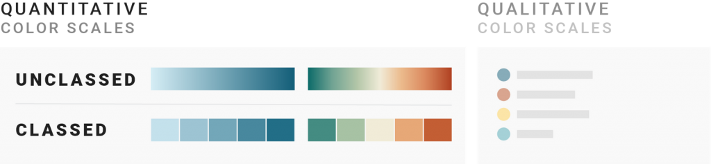
If you use a quantitative color scale, you need to decide if you want to split your values into brackets (make it classed, also called classified, stepped, quantized, graduated, binned or discrete) or not (leave it unclassed, also called continuous). This article will help you to make that decision.
1 Use a classed color scale if the data is classed
A bit of history: Suddenly, it’s possible. But should we do it?
2 Use a classed color scale if you want to communicate statistical brackets
3 Use an unclassed color scale to give a nuanced view
4 Use an unclassed color scale if you don’t want to interpret for the reader
5 Use a classed color scale if you want readers to read values
A bit of context: Maybe it’s not that important
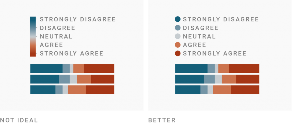
First things first: If your data isn’t continuous, don’t use a continuous color scale. Meaning, when visualizing ordinal data like Likert scales (strongly disagree, disagree, neutral, agree, strongly agree), clothing sizes (XS, S, M, L, XL), official ranks, etc., use a classed color scale. An unclassed color scale would suggest that there are options in between when there are not.
But every continuous data can be made discrete: You can always sort unemployment rates into ranges (like 2-3%, 3-4%, 4-5%, etc.) and give each range a color instead of assigning each value to one color on a gradient.
So when should you class your color scale?
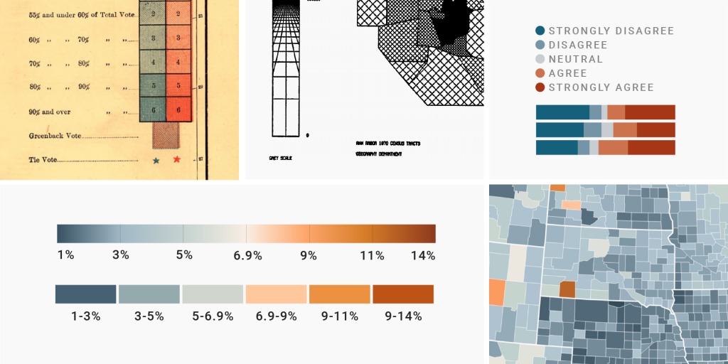
For a long time, cartographers and data visualization designers didn’t have to ask that question. They had to use classed color scales – because it proved to be infinitely difficult to calculate, paint and print unclassed ones. Here’s a map from 1883:
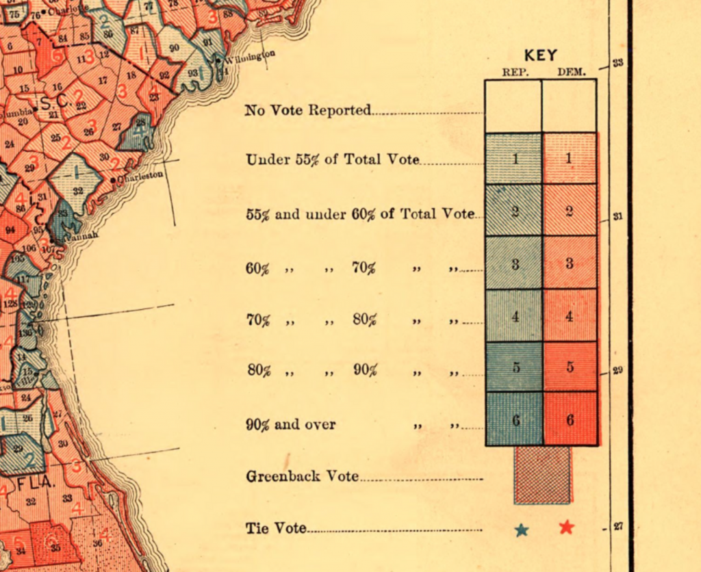
The diverging color scale in this map uses two colors: blue and red. The creator(s) printed these colors thinly to create light colors and used dense hatching for darker colors. That was what the technology at the time allowed for.
In a short research note in July 1973, cartographer Waldo R. Tobler used hatching, too, to create what was probably the first unclassed map. “It is now technologically feasible to produce virtually continuous shades of grey by using automatic map drawing equipment,” he wrote[1], and showed the following map:

Not classing numbers anymore? That was a provocative idea in the 1980s and 1990s. Cartographers asked: “Should we create these new unclassed maps that go against everything we did in the past hundreds of years; against everything we’re used to?” (Not an actual quote.) Studies were written; comments were published.
Here’s what they found out.
With classed color scales, you can make a point more easily than with unclassed color scales. You can group values (and therefore regions) with the same color together so your readers can quickly see the statement you want to make.
Cartographer Michael Dobson was a big advocate for classed maps in the 1980s. He called it a “simpler, more efficient communication device.”[2] It definitely is simpler – simplifying is the whole point of a classed map. But is it also more efficient? That depends on what you want to communicate.
If you want to communicate something very narrow, classed maps are a great choice. Cartographers Katherine Mak and Michael R.C. Coulson pointed out in 1991[3] that as soon as a map has a statistical objective, like showing
Classes are the way to achieve that. “The classification system defines itself and the focus is on which data units fall into a particular predefined class, rather than the overall pattern of the map.” If you want your readers to see if certain regions fall into a statistical bracket, use classes.
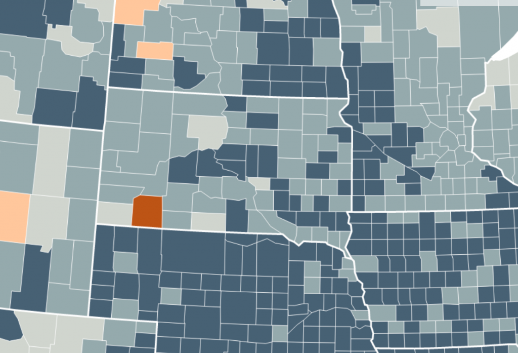
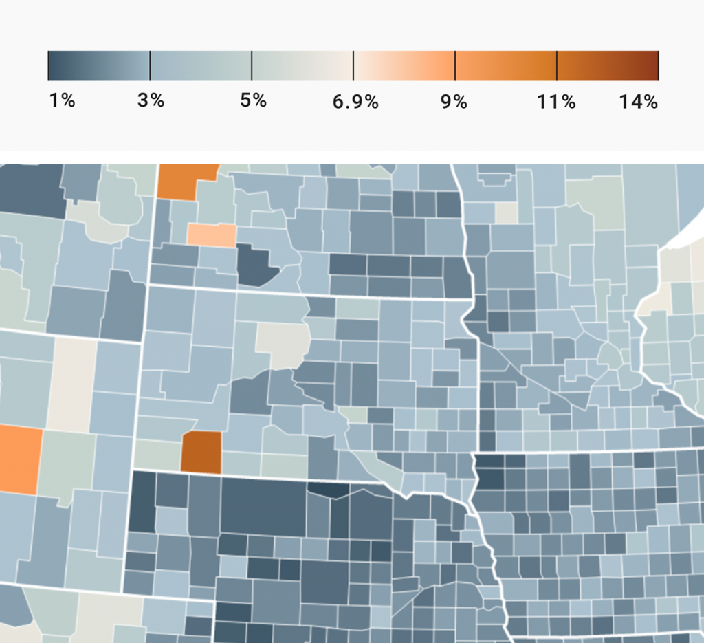
But as soon as you want to show a general pattern – e.g., “temperatures are higher in the south than in the north” or “our revenue was higher this year than last year” – an unclassed map is probably the better choice. Here’s the same unemployment map with a diverging color scale:
Note how this map makes it harder to see which statistical brackets the counties fall in – meaning, if they have an unemployment rate below or above the national one.
As the two maps above make clear, classed maps show less nuance than unclassed maps.
The unclassed map gives a more truthful, nuanced view of the unemployment rate. “The unclassed choropleth is the most exact representation of the data model possible,” Judith A. Tyner writes in her “Principles of Map Design”[4]
Communicating the complexity of the data is a noble goal in itself. If this is high on your priority list, go for unclassed maps.
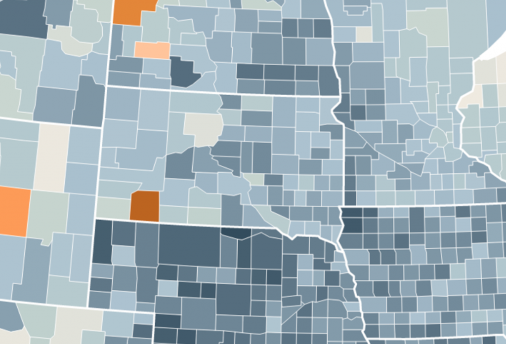
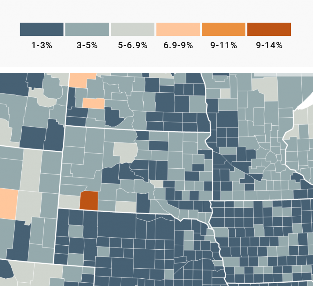
But classed maps, too, can be more or less nuanced. The more classes you show, the more nuanced your map becomes[5]. The unemployment rate map showing only two classes is an extreme example. So here’s the same map with a six classes, three above and three below the national average:
This map shows more nuance than the two-class map – but less nuance than the unclassed map.
The subtle differences you can see in an unclassed map enable readers to see things that are not important for you – but are for them. Unclassed maps make it easier to see…
To show an example, let’s zoom in on South Dakota – the state in the middle of the following images. South Dakota has an unemployment rate closer to the national average (making its blue lighter) than most surrounding states. On the unclassed map, we can see that almost all South Dakota counties that border other states have a higher unemployment rate than the counties on the other side of the state border.
In the classed map, these subtle differences are not visible. Readers can’t know if the dark blue counties in South Dakota have a slightly higher or lower unemployment rate than the dark blue counties in all the surrounding states.
If I lived in South Dakota, I’d rather see the unclassed map. “How does my region compare?” is a question that’s better answered with an unclassed map.
Classed maps enable readers to read only ranges (e.g., between 6% and 7%) – but these ones, they can read well. Mak and Coulson, who we already met a few sections ago, concluded after a study in 1991 that “classed maps have a distinct and statistical significant advantage over unclassed maps in value-estimation tasks.”[6]
Let’s have a look at South Dakota again:
On the classed map above, you can be sure that you read the value range for the regions correctly – while on the unclassed map, you can only have “good guesses”. They might be more narrow (“close to 6%” instead of “between 5% and 6.9%”), but they remain guesses.
But value readability, too, depends on the number of classes: The more classes you have, the less likely it becomes that readers will read the values correctly.
So if you want readers to read specific value ranges, go for a classed map with only a few classes. That’s especially important when you show static maps (e.g., in print or PDF reports) where people don’t have the option to see tooltips or hover over a legend.
Showing nuance, enabling readers to read values – all this not only depends on the decision if you sort your values into classes, but also from the interpolation, the number of classes, if you chose a sequential or diverging color palette, the hues, the legend you choose, etc.
So when Boren Dent writes in his classic “Cartography – Thematic Map Design” that “the burden of deciding on a classification scheme is removed from the designer” when choosing unclassed maps[7], I’d argue that this is a small burden to lift, considering there are so many challenges remaining.
And when studies and comments from the 1990s use the argument “interpretation is left to the reader” against unclassed maps, I’d point out that all these tools I just listed can still steer interpretations in very different directions.
I write about the complications of finding a good interpolation here, so let’s take legends as an example. Which one will enable readers to correctly read values in a map – the unclassed one or the classed one?
Most people (including you, I hope) will agree that the classed legend makes it easier.
How about now?

“Well, duh, the unclassed one is way better now,” I hear you say.
Creating quantitative color scales comes with a lot of challenges. Creating a good legend is one of them. Deciding for a classed or unclassed color scale is another – one that, hopefully, got a bit easier after reading this article.
No matter if you decide for a classed map at the end, you should start your process by looking at an unclassed map. This will help you see subtle differences between regions and make a conscious decision if and how you should simplify them. (That’s why Datawrapper choropleth maps use a continuous color scale by default.)
This was the last part of a series on “Which color scale to use when visualizing data” (Part 1 / Part 2 / Part 3). Do you know of any other reasons to use classed instead of unclassed color scales – or the other way round? Please leave them in the comments or let me know at lisa@datawrapper.de. Thanks for reading!
References
Comments